#12 nostalgia: shanghai stationary mudan fountain pen ink
Late nights in the faculty are when they come alive. The sound of people ebbs, and the often-unheard heartbeat of the building itself starts to pound through the empty corridors. Mechanical whirr of the ventilation system, creaks of the windows as the frames cool, and the distant echoes of other students lost in late-night sessions in the belly of the building. I always think these moments are the ones I’ll remember with the rose-tinted glasses, when a camaraderie rises between the coffee machine and the last closing announcement.
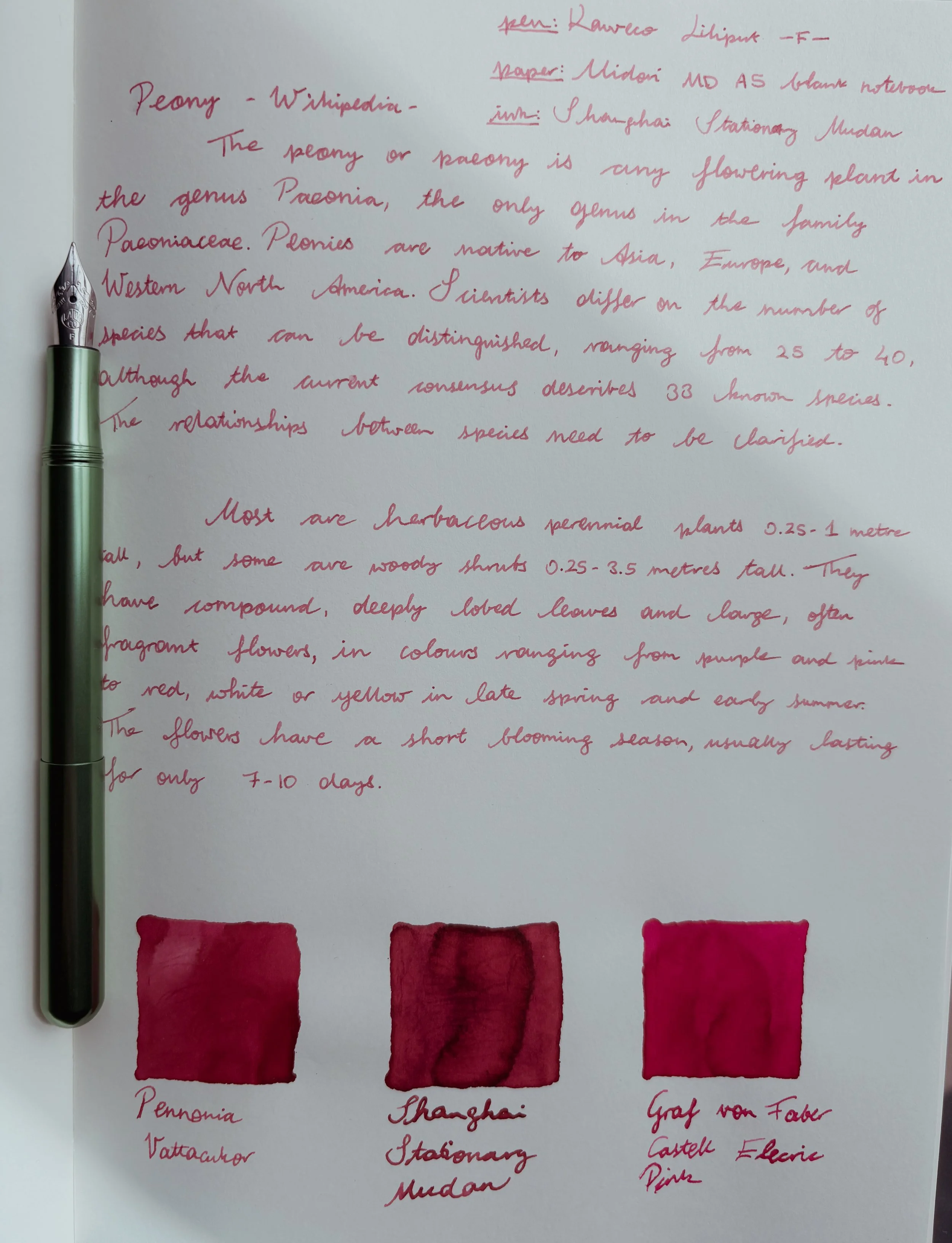
If nostalgia has a colour, it is pink. Pink is the colour of sunsets, the summer sunrises, and the earliest flowers of spring. Pink is how you want to remember something, not what actually happened. Maybe because of these associations I’m very picky with pink fountain pen inks. In my collection there are only a few of them, all similar in hue: bright pink. Shanghai Stationary Mudan is the newest of them, named after peonies.
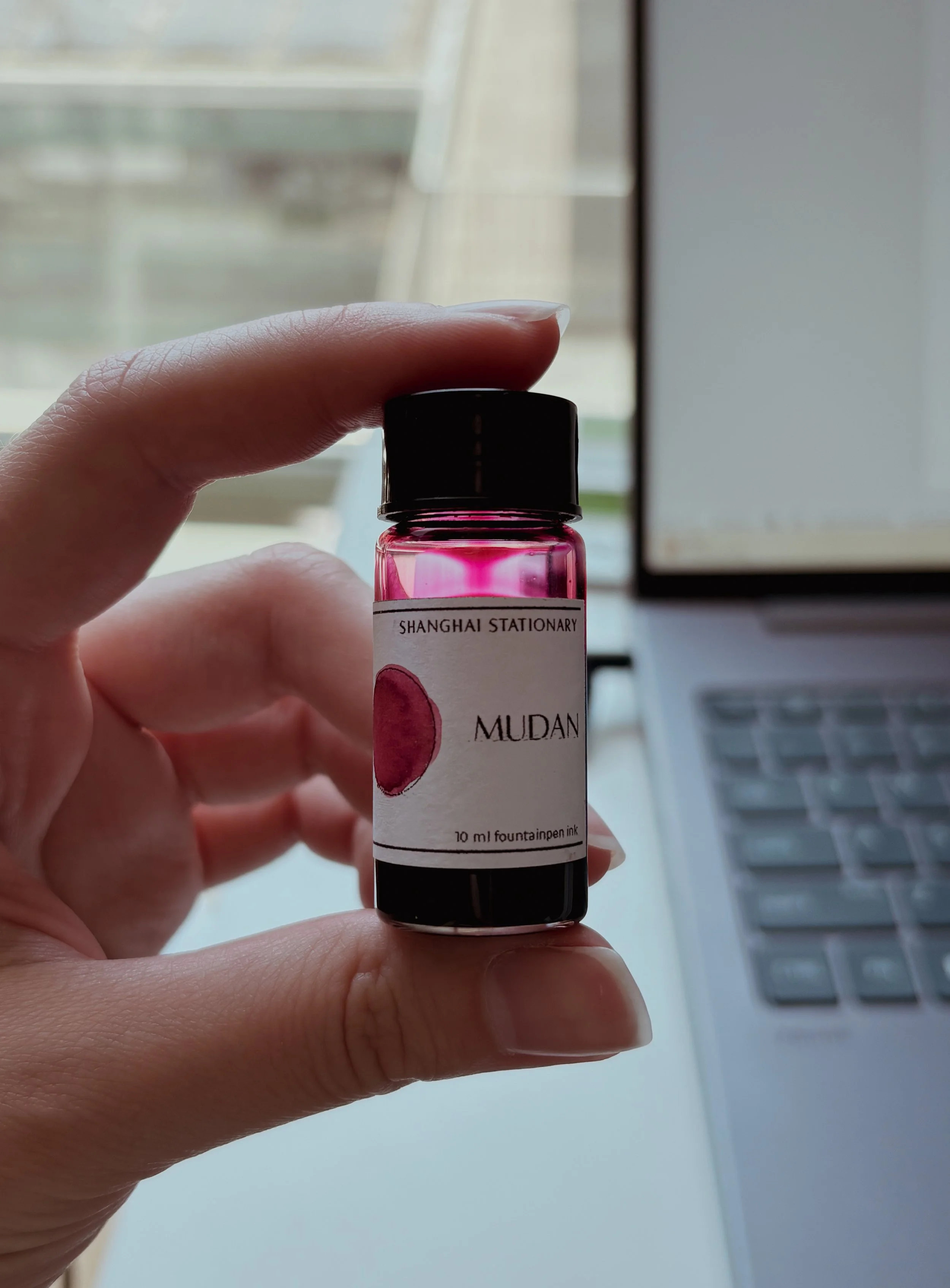
I was lucky enough to meet the lovely people behind Shanghai Stationary during the last Dutch Pen Show, they were super welcoming. My favourite thing is the little 10ml bottles they offer, it’s plenty of ink to play with before you decide on purchasing it. I get too precious with the smaller 2-3ml samples, and 10ml is the perfect size for me to enjoy. J. Herbin and Pilot make these smaller bottles as well, and it’s genuinely the best thing to become popular in the ink market.
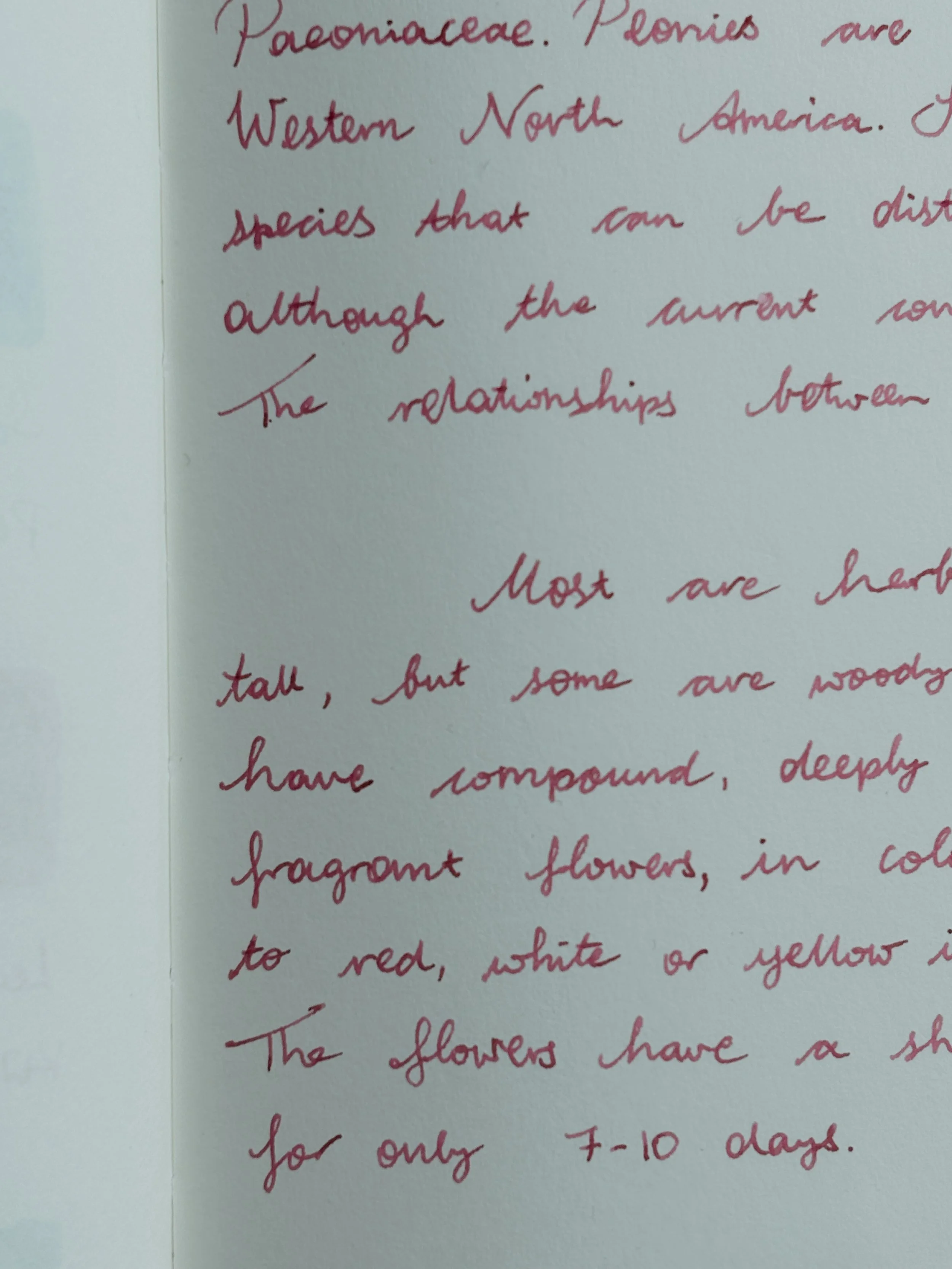
The colour palette they offer is slightly muted and well-rounded, with a few extremely interesting shades. Mudan is on the tamer end of the spectrum, a warm pink with a tiny bit of shading. The flow is on the drier side of medium, though my fondness for thinner nibs might not be letting it show its full shading potential as it came through a bit more in the swatch.
Spring and summer bring out the brightest and cheeriest inks into my regular rotation, taking the place of greys, muddy greens and dark blues. You can tell when the weather becomes sunny. Amongst my three (p)inks, Mudan is the most muted one, Graf von Faber Castell the brightest (it deserves the name of “Electric Pink”), and Pennonia’s Vattacukor is more in the middle. I do really have a type.
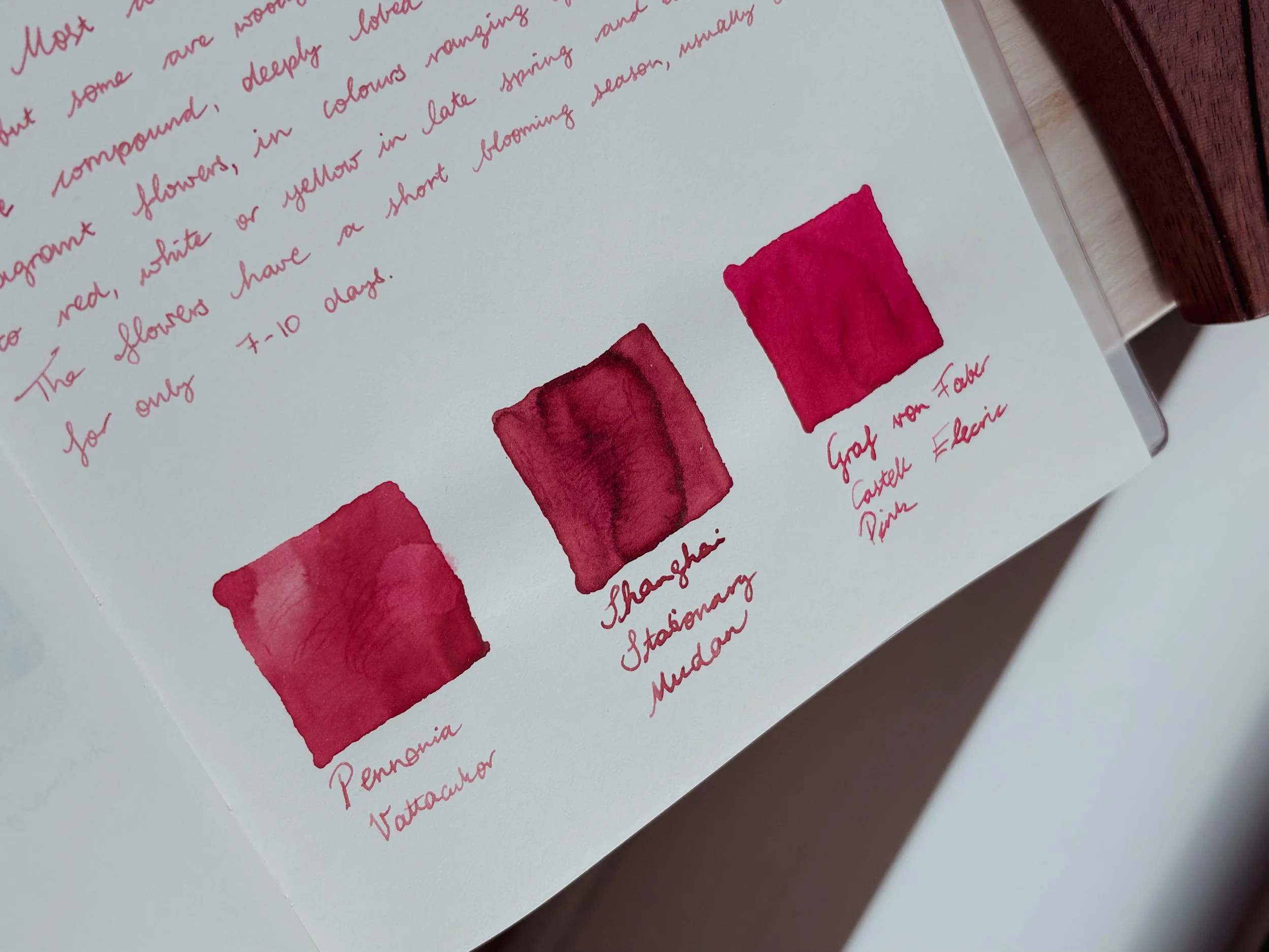
Thank you for reading this ink review! I tried to edit the photos to show the inks as accurately as possible, but as it was an overcast day with the light coming and going, I have to admit that it is not 100% accurate. Thankfully the 10ml bottles are nice :)
